Profile manual
Brand promise
""We make it easier with fiberglass""
The company delivers complete fiberglass solutions – from idea to finished installation.
Purpose
This profile manual is intended to ensure uniform and clear communication of the Glassfiber Products brand across all platforms.
Logo and symbol
Through consistent use, the logo becomes a strong symbol of the company's expertise, quality and technical solutions in fiberglass.
Logo colored positive
Logo yellow
Logo positive
Logo colored negative
Logo negative
Logo vertical colored positive
Logo vertical yellow
Logo vertical positive
Logo vertical color negative
Logo vertical negative
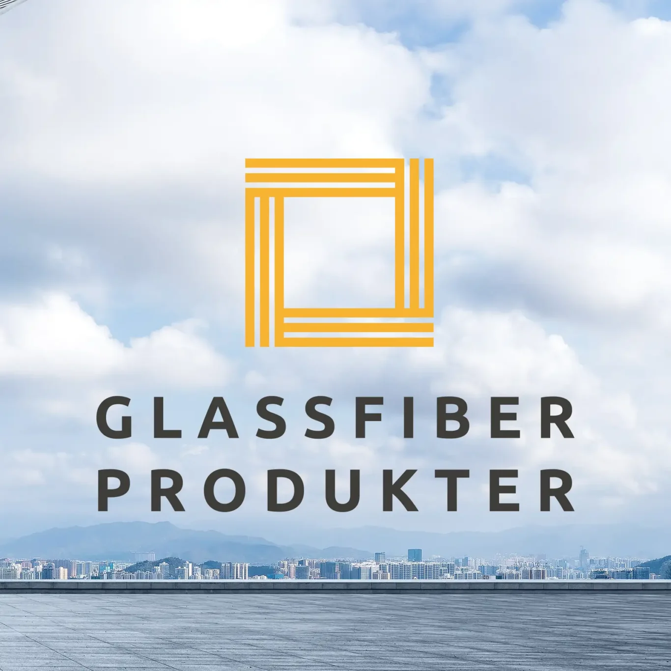
The logo symbol draws inspiration from the characteristic lines and structures of fiberglass products. The shape is developed based on the material's structure – constructed in layers to provide optimal strength and stability – and serves as a visual reflection of what we deliver.
The geometric expression highlights the key properties of fiberglass: precision, flexibility and durability. At the same time, it gives a technical and modern feel, balanced with a simple and clear shape that is easy to recognize.
The result is a logo that both represents the material itself and supports our position as a professional and forward-looking player in the market. It should always appear clear, precise and consistent across all surfaces.
Logo for digital use
Download logo files adapted for digital surfaces. Formats included in the package are: SVG, webP, PNG and JPG
Logo package, digitalLogo for printing
Download logo files suitable for printing. Formats included in the package are: PDF and EPS
Logo package, printLogo for office 365
Link to default logo:
http://glassfiber.no/wp-content/uploads/Glassfiber-logo.png
Link to alternative logo:
http://glassfiber.no/wp-content/uploads/Glassfiber-alternativ-logo.png
Contrast ratio, use of logo on different backgrounds
Use of logo
The main rule is: Logo Colored Positive should be used on light surfaces, and Logo Colored Negative on dark surfaces.


Logo Negative or Logo Positive should be used when the logo is placed on photographs or bright, saturated color surfaces where the contrast between the logo yellow and the background is too low. The same applies when placed on dark tones that provide low contrast to the logo yellow. Always use discretion to ensure that the logo appears clear and easily readable.
To ensure that the logo is clear and easy to read, it should always be placed in a prominent position with sufficient clearance around it. This clearance should provide a good distance from other visual elements.
Free area
To ensure that the logo is clear and easy to read, it should always be placed in a prominent position with sufficient clearance around it. This clearance should provide a good distance from other visual elements.
Free area
The logo should always be used as a standalone element – regardless of the background. Below are examples of incorrect use:
Incorrect use of logo
The logo should only be used in the colors defined in this profile manual.
The logo should not be altered, distorted or redrawn.
The logo should not be shaded.
The logo should not be displayed as an outline only.

The logo should only be used in the colors defined in this profile manual.
The logo should not be rendered with gradients.
The logo should not be rotated.
The logo should not be stretched or altered in proportions.
Glassfiber Products' main font is Poppins. This font should be used on all surfaces where possible to ensure a uniform and professional look.
Typography
In applications where Poppins is not available, such as Outlook, PowerPoint or Word, the additional font Aptos should be used. Aptos is part of the Office suite and ensures a consistent appearance across applications that use this software.
Main font: Poppins
Poppins can be used in these variations: Regular, Medium, SemiBold and Bold.


Additional font: Aptos
Aptos can be used in these variants: Light, Regular, SemiBold and Bold


Glassfiber Products has chosen two main colors and one supporting color that form the core of our visual identity. The colors have been carefully selected to reflect our values and create a clear and recognizable expression.
Colors
The combinations of the main colors are designed to provide flexibility in your design work while maintaining a consistent visual style. The different color combinations and guidelines for use are described in this profile guide.
Our color palette


HEX: #FCCE85
HEX: #FDDDAA
HEX: #FDF7E7
Yellow
CMYK: 0 33 91 0
RGB: 246 178 51
HEX: #F7B233


HEX: #FDF7E8
HEX: #ACABAA
HEX: #FDF7E8
Black
CMYK: 67 63 66 64
RGB: 48 46 42
HEX: #2F2E2B
HEX: #F3F2EC
HEX: #F7F7F4
HEX: #FDFCFC
Gray - support question/bg
CMYK: 7 6 10 0
RGB: 234 231 223
HEX: ##EBE9E1
Support graphics
The supporting graphics for Glassfiber Products have been developed to reinforce the visual identity and support the technical expression of the brand.
Developed from the characteristic structure and construction of fiberglass, it consists of simple, technical shapes inspired by lines, layers and modular patterns. These elements reflect the material's properties and support the company's core values: precision, strength and flexibility.
Download supporting graphics
This package includes all supporting graphics for both screen and print in SVG, webP, PNG, and EPS formats.
Support graphics package
Grate yellow

Shake positive

Shake negative

Pattern yellow

Pattern positive

Pattern negative

Pattern rotated yellow

Pattern rotated positive

Pattern rotated negative

Arrow yellow

Arrow positive

Arrow negative
If you have any further questions, please contact us.
Contact us